BResearch
Created a platform for UCLA students to look for and apply to research opportunities at labs at UCLA.
DevX at UCLA
Role:
UI/UX Designer
Year:
2023

Roles
I adopted the following roles in the development of this app:
User Experience Researcher
User Experience Designer
User Interface Designer
Deliverables
High Fidelity Wireframes of web app
Competitor Analysis
User Research Surveys
User Journeys
Design System
Low Fidelity Wireframes
Usability Testing
Duration: 1 year
Tools:
Figma
Google Forms
FigJam
Adobe Illustrator
The Problem Statement
UCLA, a prominent research university, struggles with an outdated and infrequently updated Undergraduate Research Portal. As a result, undergraduates resort to cold emailing numerous professors and graduate students, leading to a time-consuming and inefficient process for both students and faculty. To address this issue, our DevX team at UCLA has developed a digital solution that centralizes all research opportunities, simplifying the search process for everyone involved.
Research and Analysis
Key Findings
Our research, which is detailed below led us to prioritize the following:
Create a job board with easy to navigate and familiar UI
Different screens for student and professor views with separate features for each, as indicated in conversations with stakeholders
Design a good filtering system to help users have a simpler user experience
Simple and customizable app tracker, a major user want expressed in the research surveys
Easy editing for profiles and job posts for both students and professors, indicated in user research
Market Research
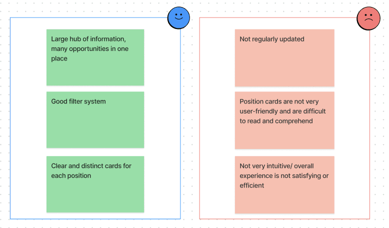
We started by analyzing the existing undergraduate research portal, noticing its Pros and Cons, listed below:
User Research
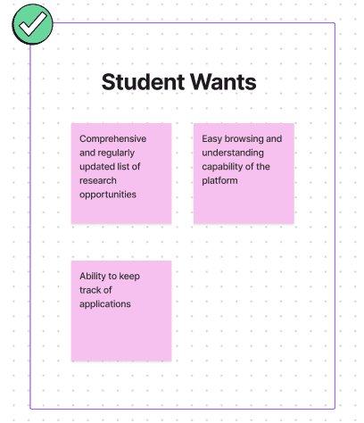
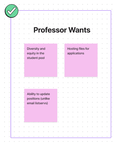
Next, we analyzed our target audience and tried to figure out their needs. After conducting user surveys through google forms, we found that our web app would primarily cater to two types of users: UCLA Students, and UCLA Professors/Lab Managers. The survey showed that over 80% of the professors and 100% of the students would be interested in our application. The main user wants are detailed below:
Design Process
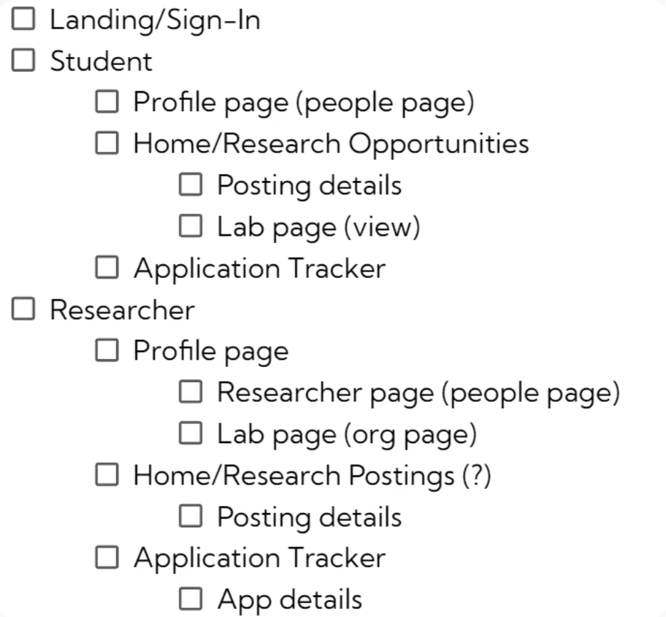
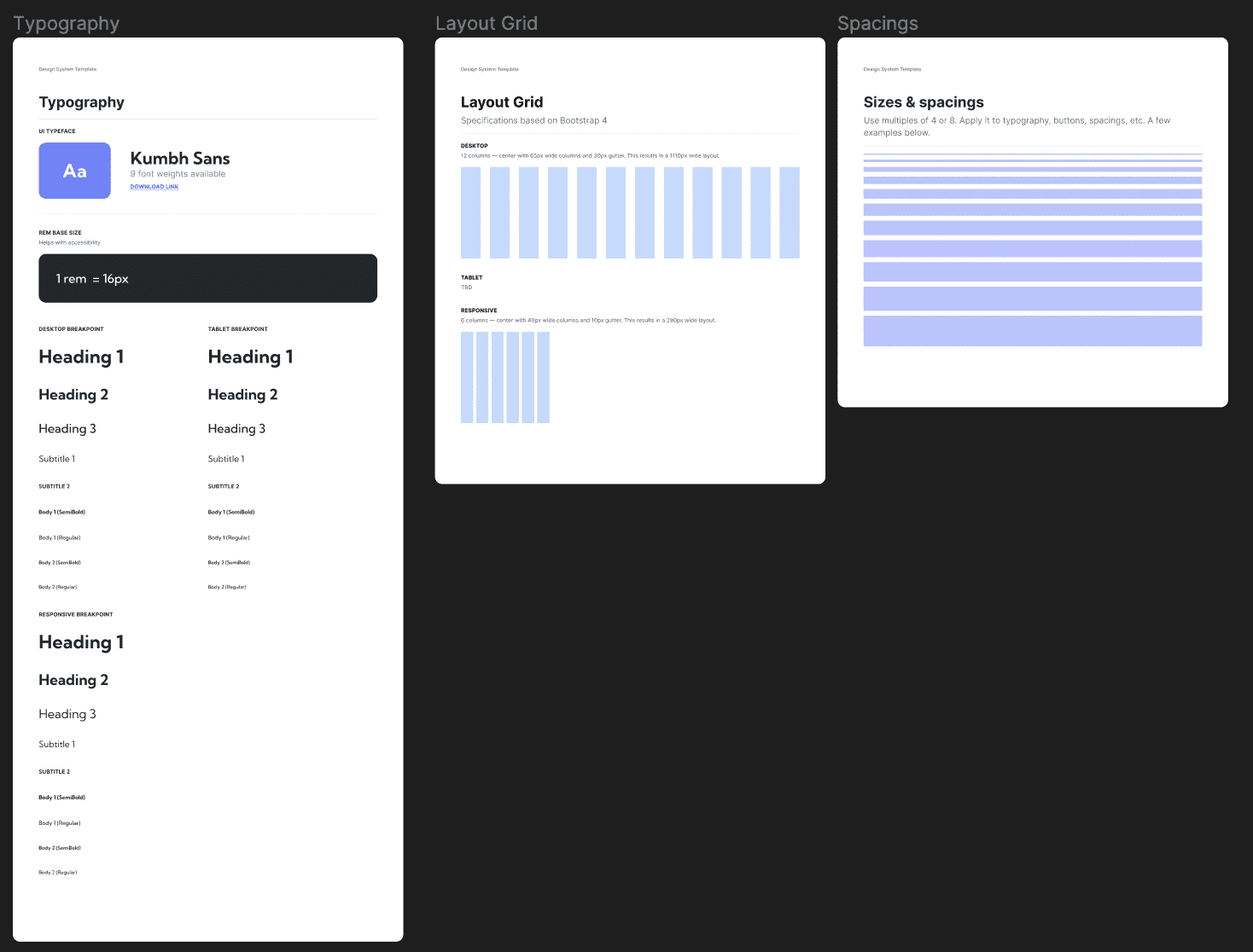
We first created user journeys and requirement lists for the web application, as well as a basic design system containing the color scheme, the logo, and other components part of our visual identity based on our research findings. We then iteratively designed low-fidelity and high-fidelity wireframes of bResearch based on the requirements and the finalized visual identity.
While designing bResearch, my design team and I were in constant communication with the developers and the marketing team to make sure our designs were achievable and in line with our goals. Overall, we wanted to keep the design minimalistic, familiar, efficient, and user-friendly (referencing common patterns found on job posting sites such as LinkedIn, Indeed, and WayUp).
Requirement List
User Journeys
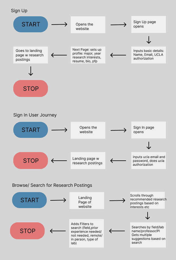
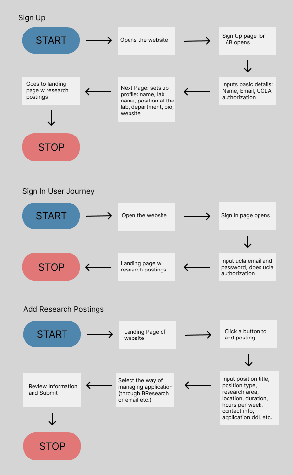
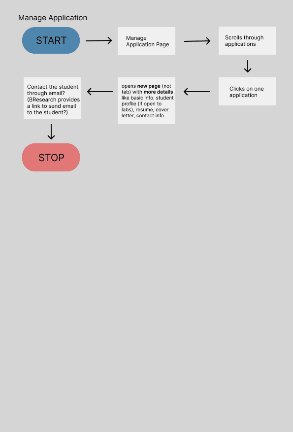
We created different user journey flows for both the students and the professors to get a deeper understanding of how users might interact with the platform, which would help inform what features to emphasize and how to determine the site structure.
Student User Flow
Professor User Flow
Design System
Low Fidelity Wireframes
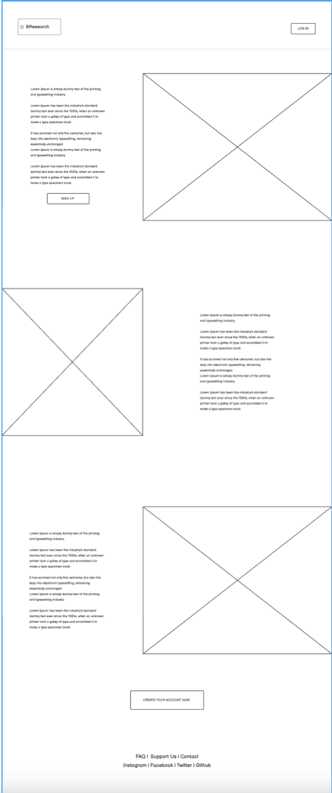
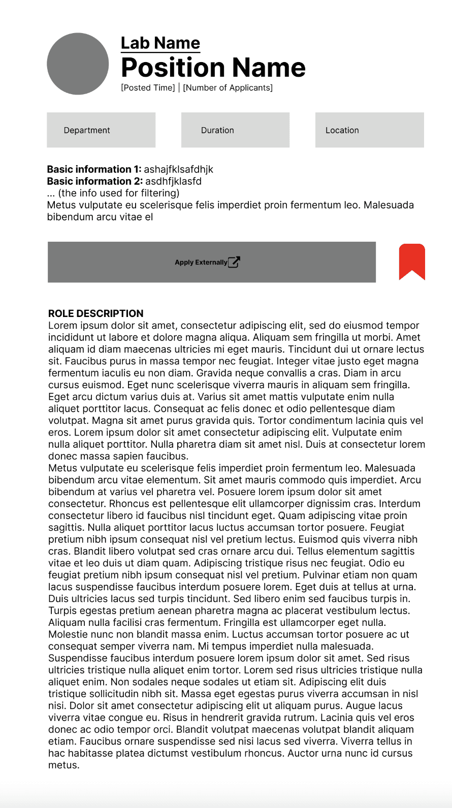
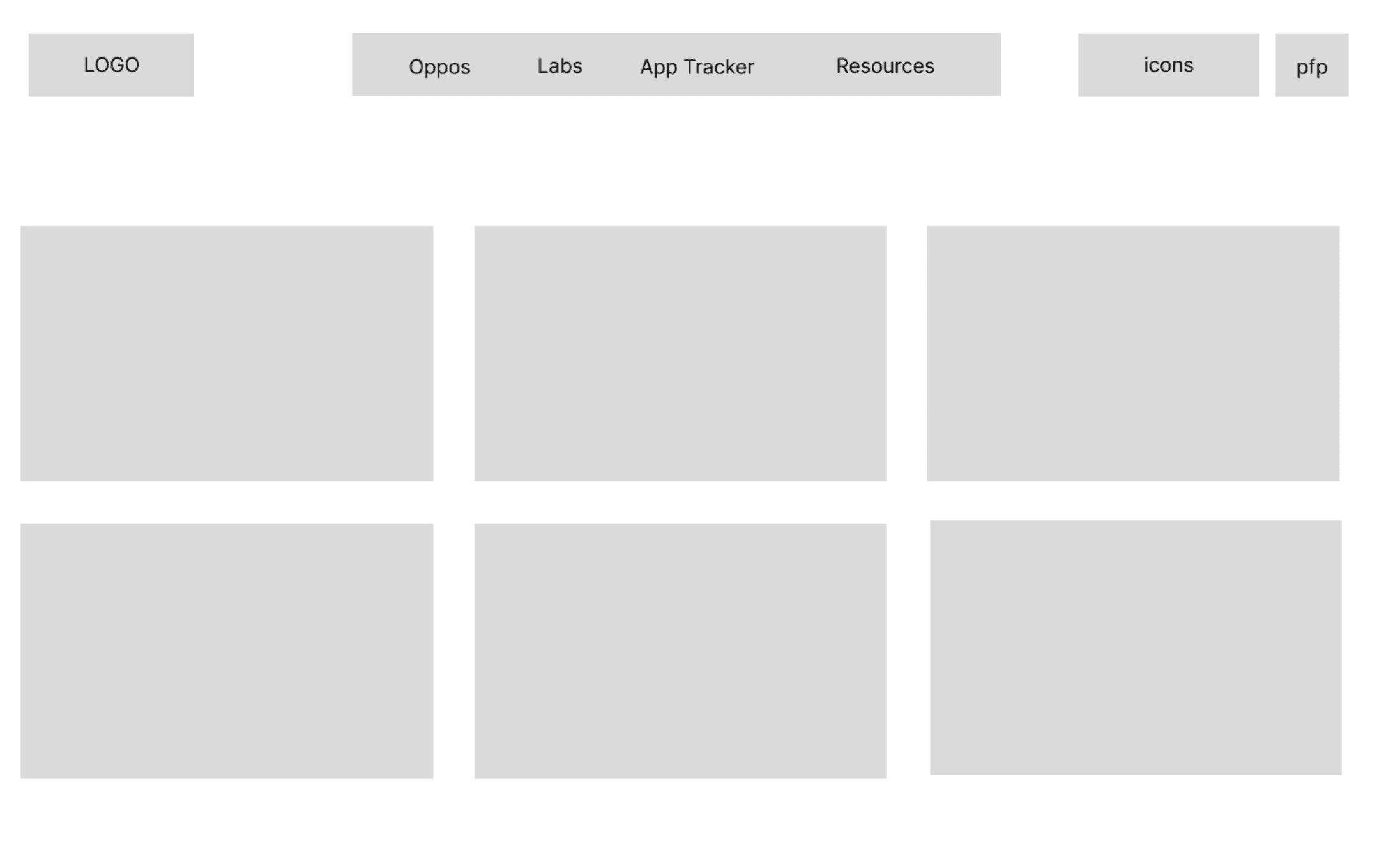
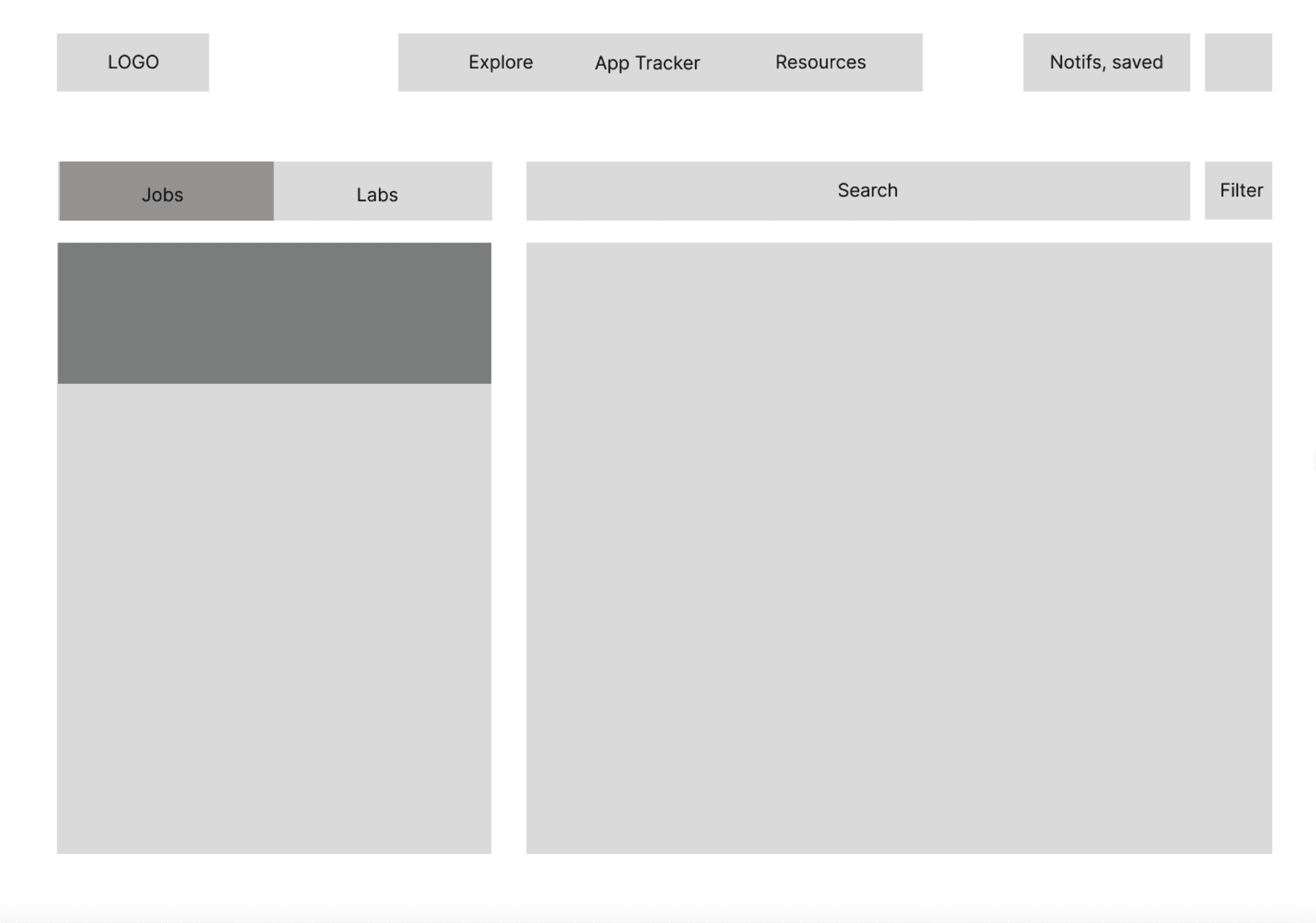
We created low fidelity wireframes for some key pages like the landing page, position page, lab search page, and job postings page using a simple blocking method. This helped us envison what the wep app would look like and what features it would have. We opted to focus on the student view first and then create the professor view based on that.
Landing Page
Position Page
Lab Search Page
Jop Postings Page
Our Solution- High Fidelity Wireframes
Our solution consists of a Student View and a Professor View. Both views consist of Profile Pages (Creating, Viewing, and Editing), App Tracker, and Job Postings. The Student View is detailed first, then the Professor View.
Student View
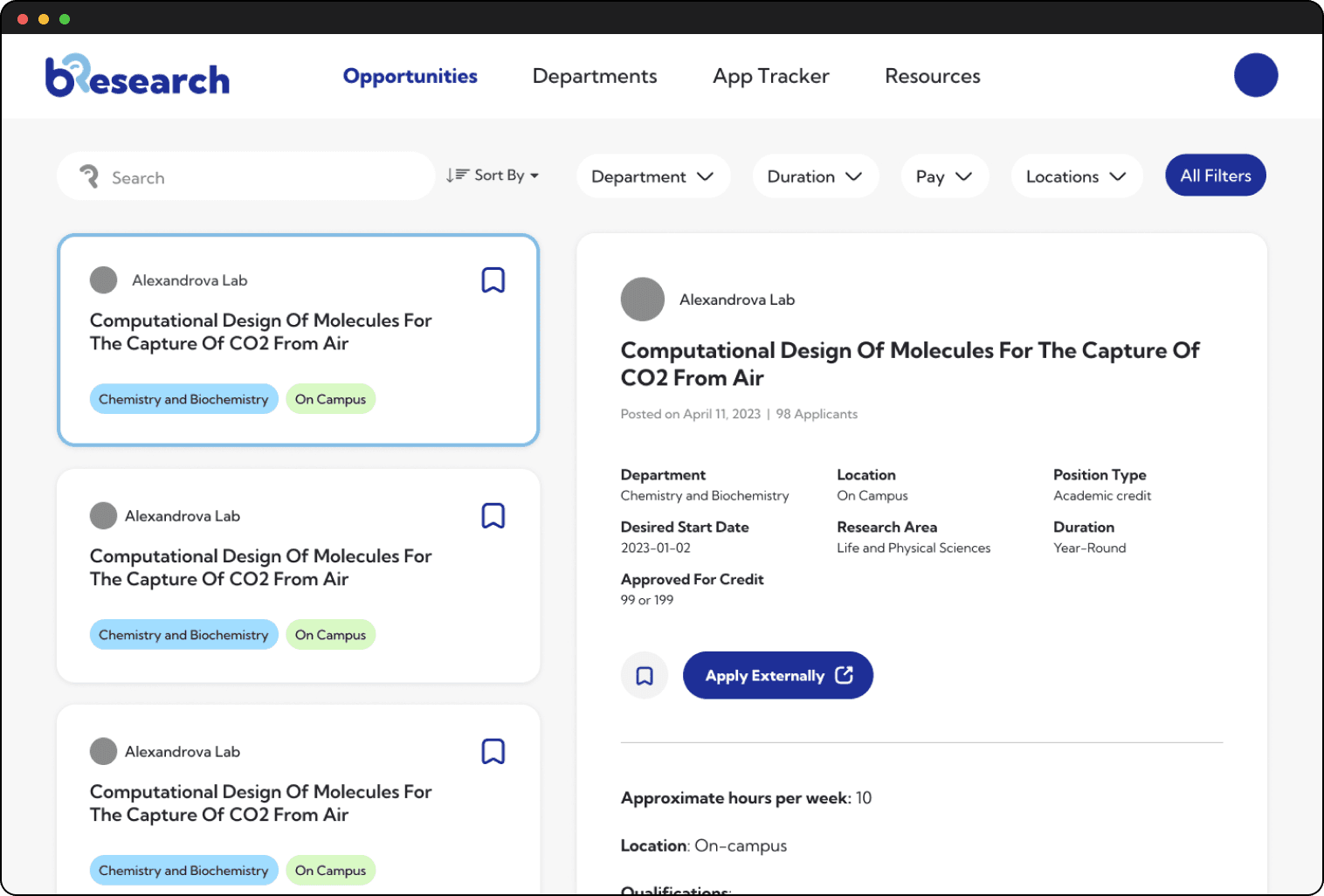
Job Postings Page
We designed a simple and interactive job postings page similar to others that our users interact with often, so that there was no learning curve while using our web app. Additionally we also decided to arrange the actual job posting information in a way that it wasn't very text heavy and there weren't any long paragraphs so that it was easier to skim, an insight from early stage usability testing.
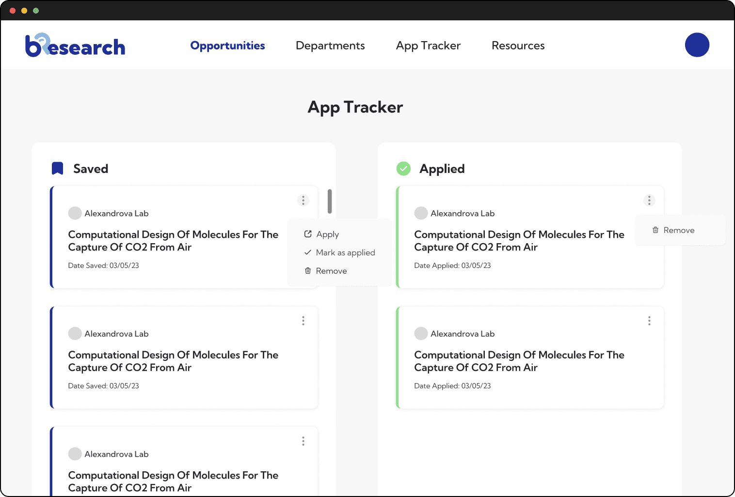
App Tracker Page
We kept the app tracker minimalistic as well as enabled custom entries so that our users could use it as they pleased, for research opportunities available on our platform and otherwise.
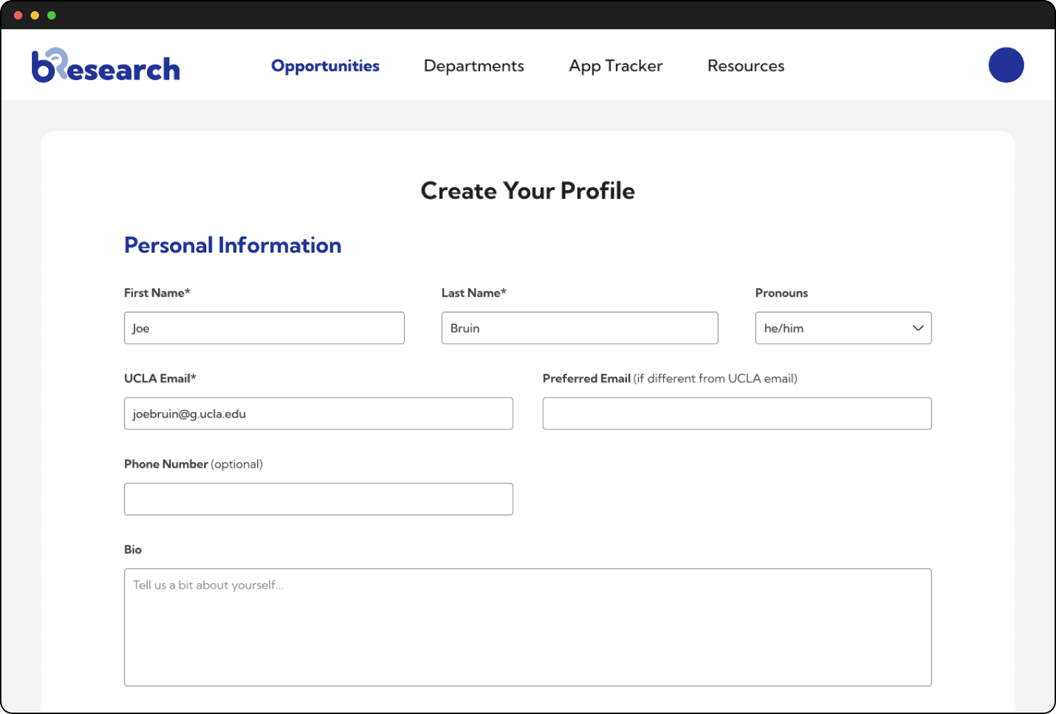
Create Profile Pages
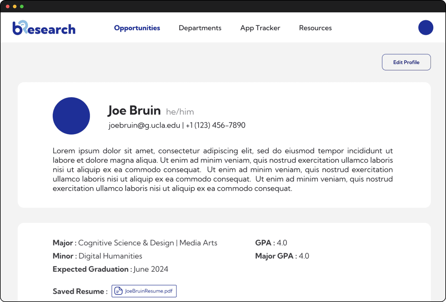
We prioritized inputting all important information in one profile so that users didn't have to enter custom information for different research positions, thereby simplifying their user experience.

Profile Page
Professor View
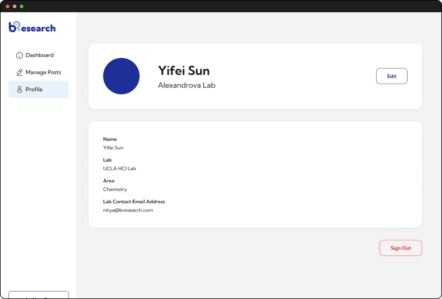
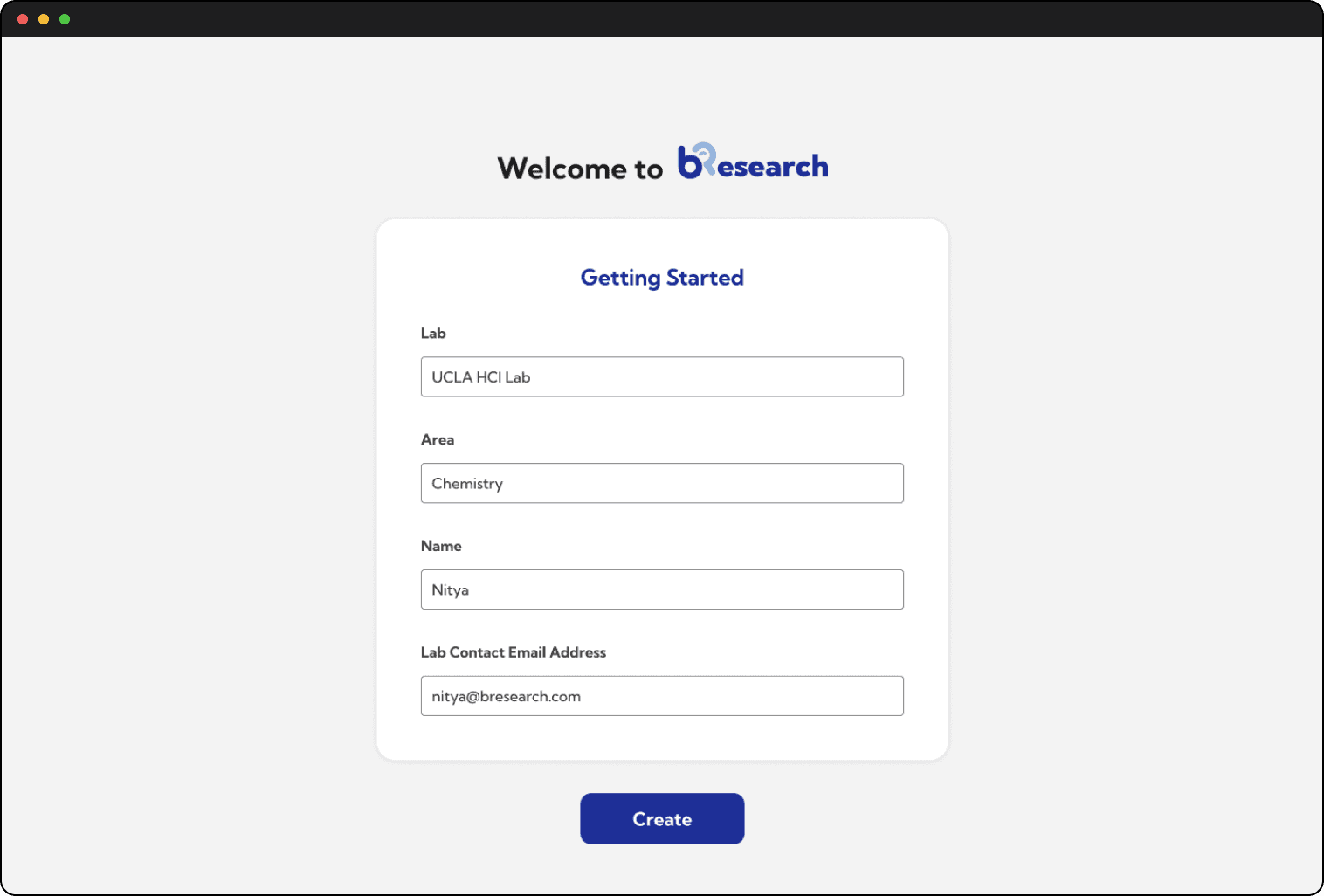
Professor profile and sign up pages are structured to not be very information heavy to allow them to focus on inputing important information in their research opportunity postings rather than their profiles.
Profile Page
Sign Up Page
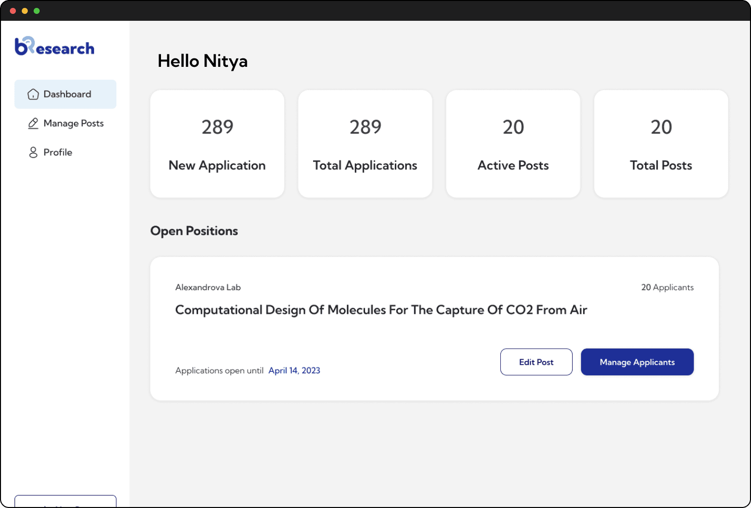
Dashboard Page
The professor dashboard displays all important information right on top, as well as a easy access nav bar on the side to view all relevant pages at the click of a button. Our user research with professors helped determine what features to highlight on the dashboard: number of applications, number of postings, manage postings, view open positions.
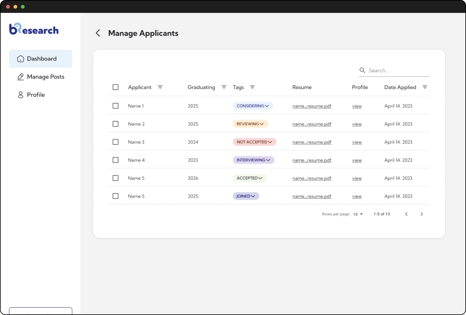
Manage Applicants Page
Each posting has a manage applicants page where the professors can easy change the applicant status and view all important details about the applicants, which early stage user testing revealed was a very helpful feature for professors who want to easily view and manage all applications in one place.
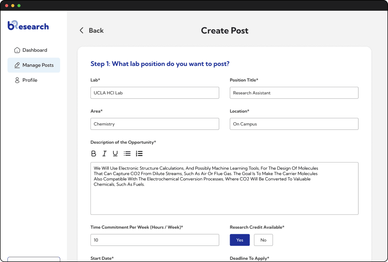
Create Job Post Page
The create post page allows professors to input all important information and criteria about a research position so that potential applicants have all the information they need before applying, which eliminates inquiry based cold emails which currently waste both the professors' and the students' time.
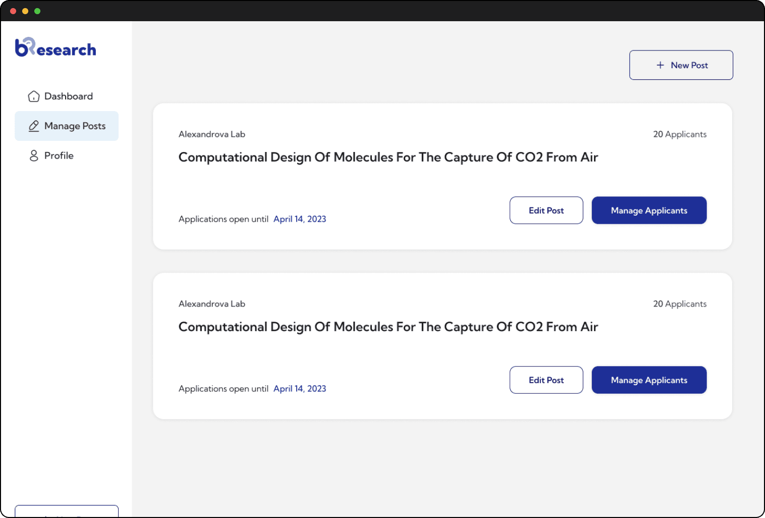
Manage Job Posts Page
This page allows professors to easily add and edit job posts, as well as view all their posts and manage all applicants.