Quizl
Created a digital study buddy that not only reduces distractions but also promotes healthy learning strategies.
Creative Labs at UCLA
Role:
Project Lead
Year:
2023
Roles
I adopted the following roles in the development of this app:
Product Manager
User Experience Researcher
User Experience Designer
User Interface Designer
Product Design Lead
Deliverables
High Fidelity Wireframes of mobile app
User Incentivization concept
Competitor Analysis
User Research Surveys
Design System
Low Fidelity Wireframes
Mid Fidelity Concept Wireframes
Usability Testing
Duration: 8 weeks
Tools:
Figma
AdobeXD
Google Forms
FigJam
The Problem Statement
In the contemporary digital environment, where our daily activities, including learning and entertainment, are predominantly conducted online, individuals face the challenge of managing distractions that are readily accessible through digital devices. Despite the shift of education to the digital realm, the prevalence of distractions poses a significant impediment to effective learning. The absence of tools that seamlessly integrate distraction-limiting features with well-established psychological learning strategies leaves a gap in the market. This is where our app, Quizl enters the picture as it not only addresses the issue of digital distractions through an app lock feature but also enhances the learning process by incorporating proven psychological learning strategies like tests and quizzes. This product aims to optimize the online learning experience and improve user focus, contributing to a more productive and enriching digital lifestyle.
Research and Analysis
Key Findings
After concluding user and market research (detailed below) we found that we had to prioritize the following:
Engaging and personalized app lock with modern UI
An incentivization system to make users want to use the app and continue using it in addition to the emphasis on healthy learning strategies
Easy onboarding, since most other app locks have complex onboarding processes which many users find frustrating
Options to disable and customize app lock timer and target apps as this was a major pain point indicated in the user research
Market Research
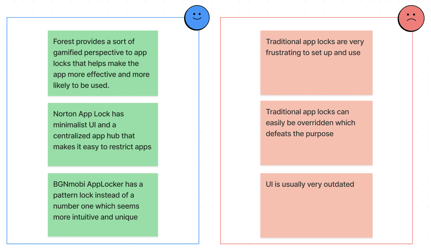
We started by analyzing the existing intuitive app locks and educational platforms individually. Some specific apps we looked at were Forest, Norton App Lock, and BGNmobi AppLocker. The Pros and Cons of our market research are listed below:
User Research
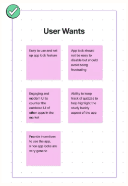
Next, we analyzed our target audience and tried to figure out their needs. As we started out we knew our app would cater to students from many different backgrounds, from kids in primary school whose parents want to limit their distractions to college students cramming for their finals. We conducted a user survey, that indicated the following user requirements.
Design Process
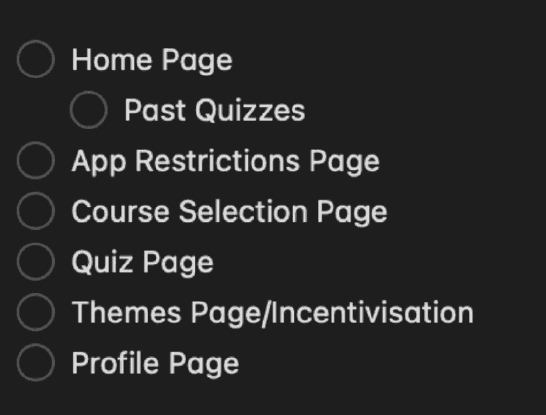
We first created a requirement list for the app, as well as a basic design system containing the color scheme, the logo, and other components part of our visual identity based on our research findings. We then iteratively designed low-fidelity and high-fidelity wireframes of our app, while also working on creating a brand identity for the app based on the requirements and the finalized visual identity.
While designing and creating Quizl, I was leading the designers and the marketing team, while also overseeing the developers and communicating with them to ensure our product design was attainable. Overall, we wanted to keep the design engaging yet professional, and minimalistic yet efficient and user-friendly.
Design System
Requirement List
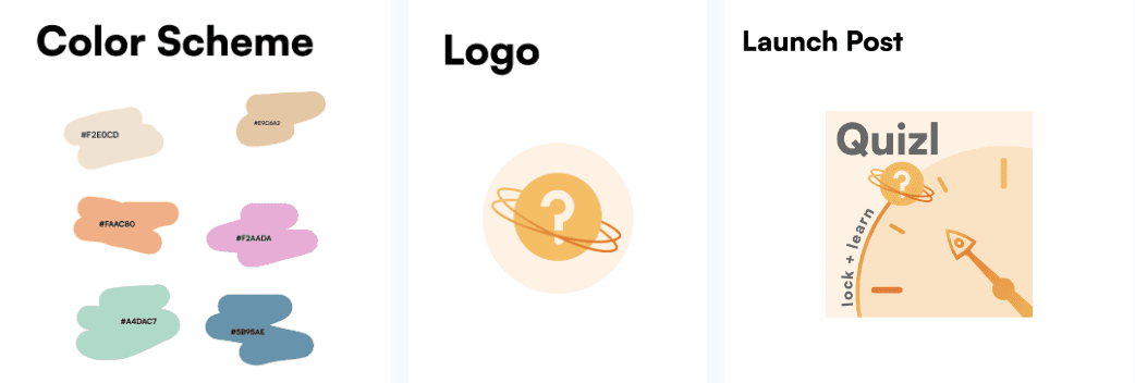
Color Scheme, Logo, and Graphics
We chose warm and vibrant colors to stand out among existing app locks, as well as to make the UI more engaging. Our logo is in line with our space theme which plays into the gamification of our app to incentivize users.
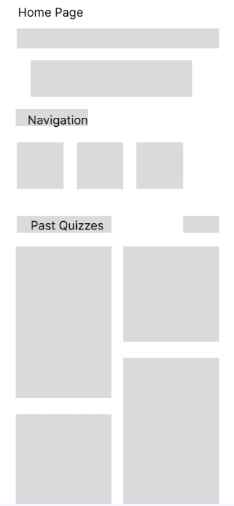
Low Fidelity Wireframes
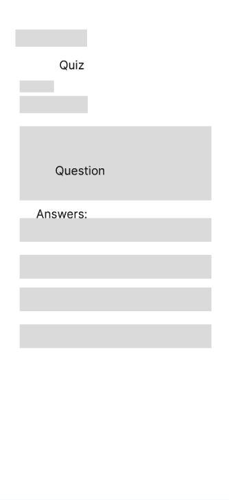
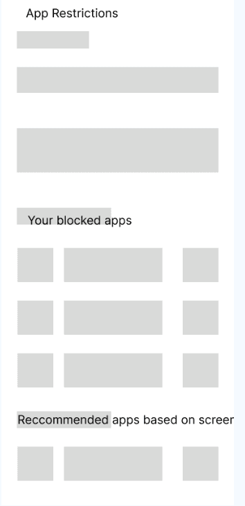
Our low-fidelity wireframes were a way to organize our research findings, requirements, and vision for the app into a tangible idea of what the app would look like using a simple block technique to envision the app.
Theme Concept
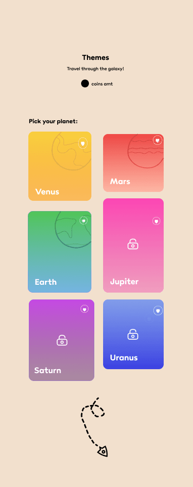
As an incentivization strategy, we decided to incorporate a theme feature based on the solar system where users could unlock new customizable themes based on how often they use the app lock and how many quizzes they complete.
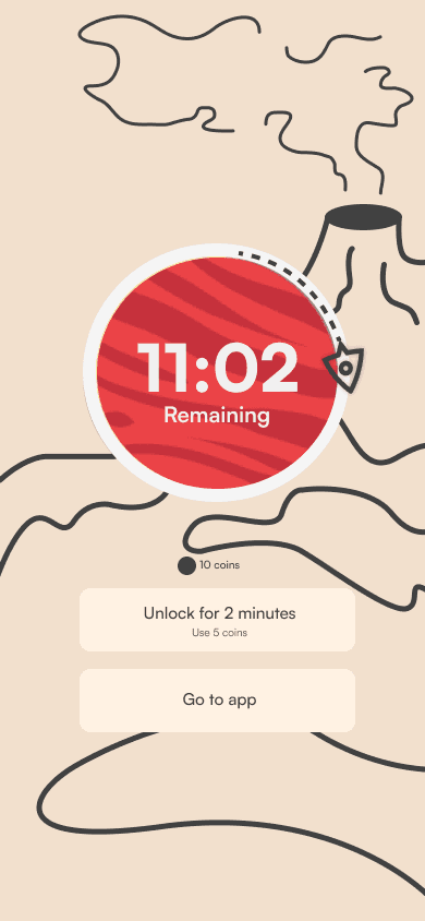
We also aim to incorporate a coins system where you can earn points by using the app to restrict other apps and do quizzes to practice, and you can trade in the coins for various rewards like extra time on the restricted apps as well as to unlock the different customizable themes.
The following is a low fi of the theme components:

Mid Fidelity Wireframes
Theme Concept
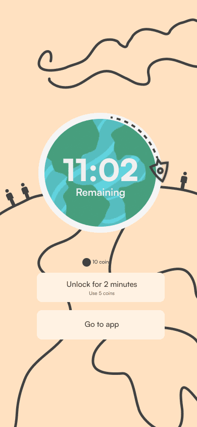
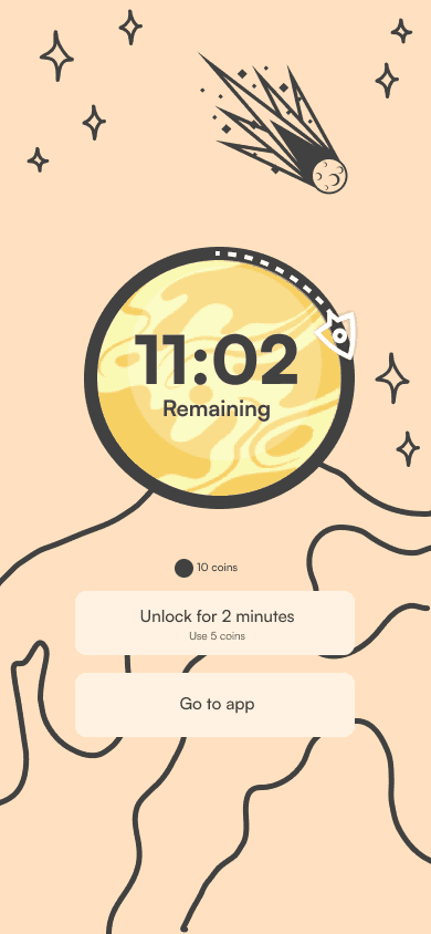
These mid fidelitly wireframes of the theme concept shows how the points could be used to unlock new themes and how you could navigate between the themes.
The actual theme pages themselves show how the timer would be customized based on the chosen planet and there would be components based on each planet to make the screen unique and interactive.
High Fidelity Wireframes
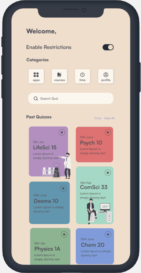
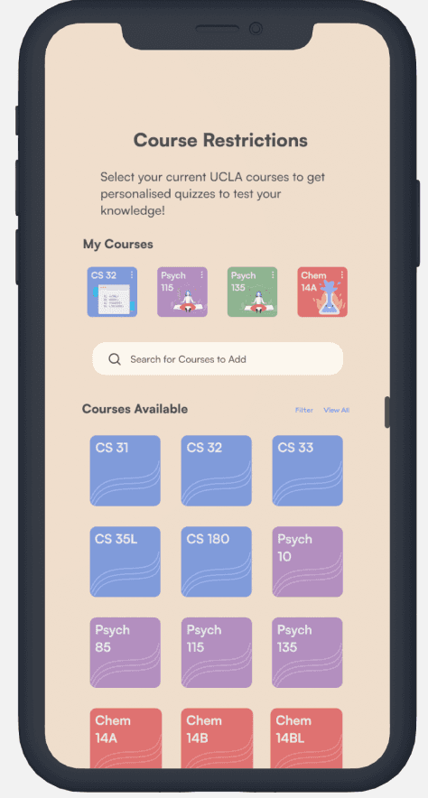
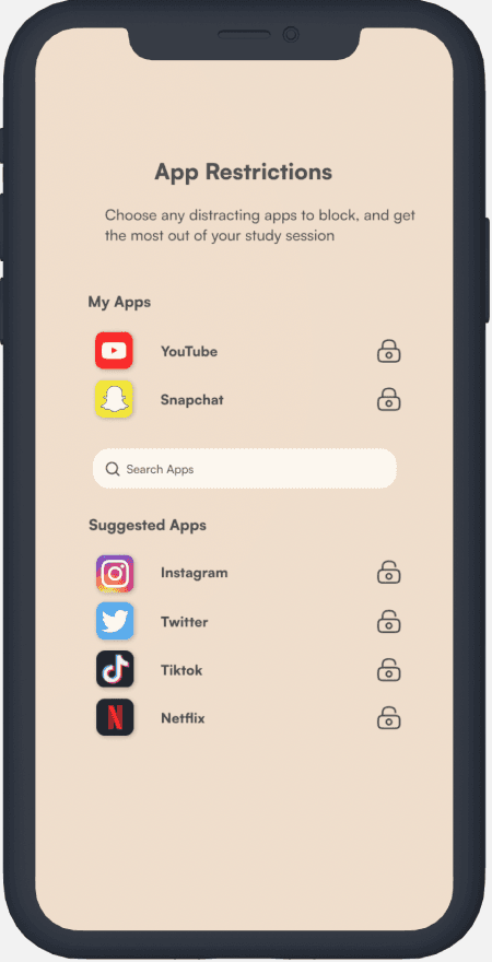
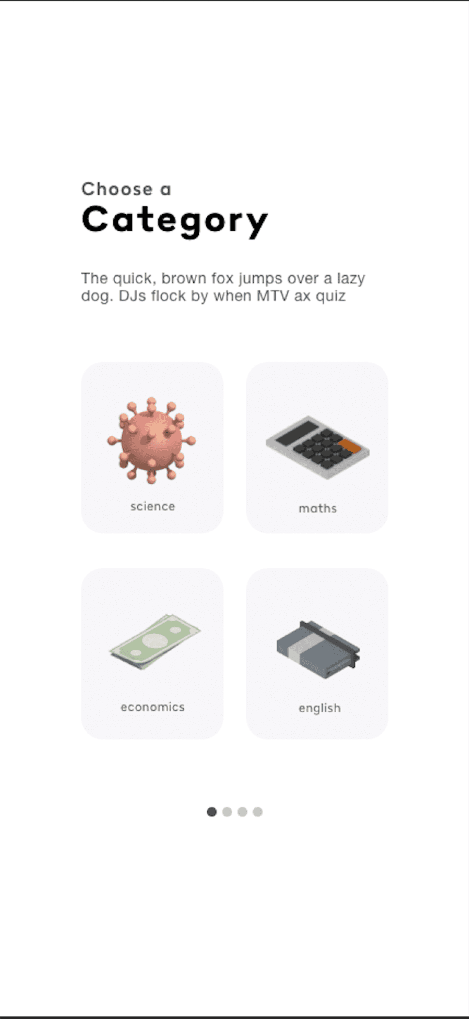
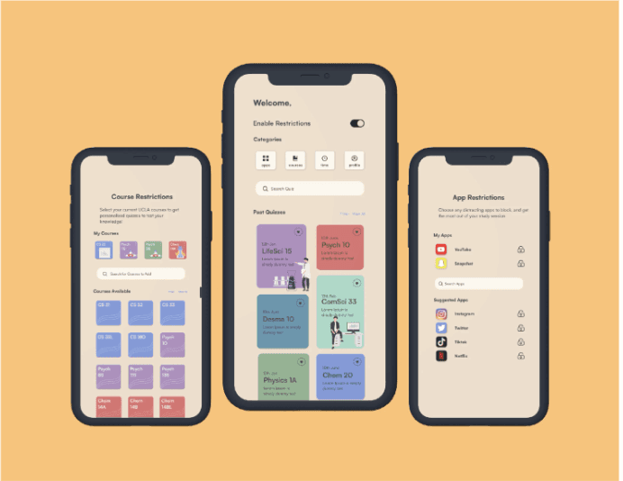
Our app consists of the Standard Pages: Past Quizzes and Navbar, App and Course Restrictions, and Quiz Pages.
Past Quizzes and Navbar Page:
We included a simple enable and disable restrictions button to make our applock easy to use. Next we wanted out navbar to be under a categories section to play more into the gamification of the app. Finally we wanted to display past quizzes on our home page to emphasize the learning aspect of our app as well as to help users easily access their history since it was one of the main user wants.
Course and App Restrictions Pages:
These pages have a short description and a central search bar followed by a simple list for easy navigation.
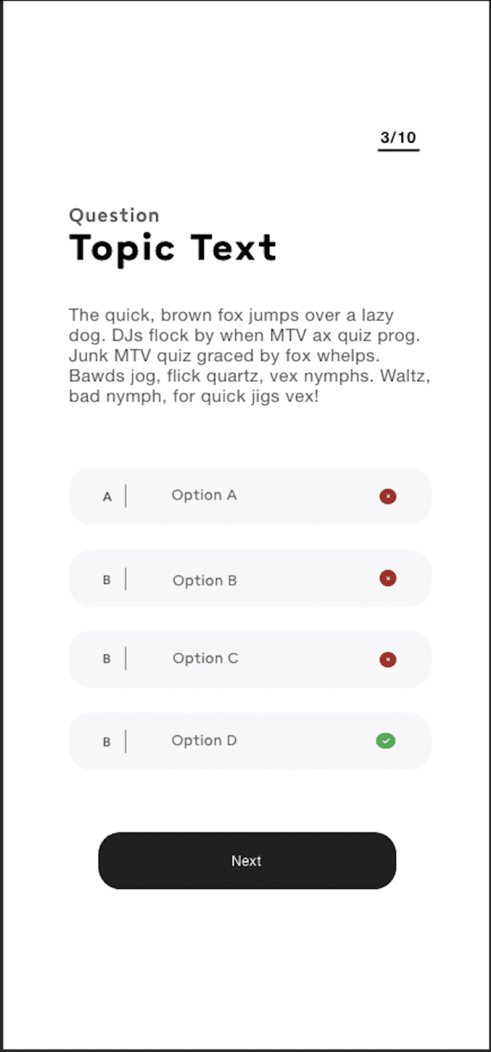
Quiz Pages:
We decided to make the quiz feature more standardized as it will be accessed while trying to access another app and we wanted the transition to be as seamless as possible for the user so we opted for a theme that would go with most apps.